
Mobile Website Design for Whitby & Durham Region Businesses
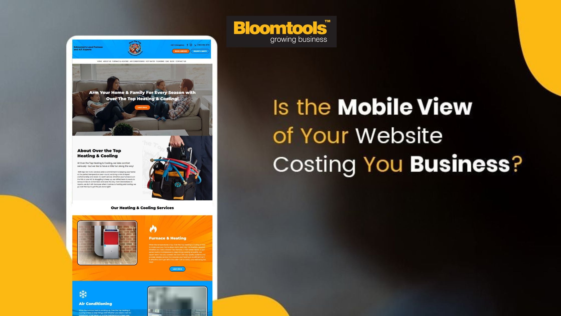 "Mobile Website Design for Whitby & Durham Region Businesses")
Is Your Website Mobile-Friendly? Why It Matters for Businesses in Durham Region
In 2025, most customers are discovering local businesses like yours using their phones — not desktops. Whether they’re researching, booking, or buying, their first impression is happening on a mobile screen.
In Whitby and throughout the Durham Region, we’re seeing mobile traffic make up over 60-70% of total website visits. If your site isn’t built with mobile-first design in mind, you could be missing leads — and sending potential customers to your competitors.
Why Mobile Website Design Matters More Than Ever
Today’s users expect lightning-fast load times, simple navigation, and a smooth experience. If your mobile website is clunky or hard to navigate, you risk:
Losing leads and enquiries
Lower conversion rates
Weak visibility on Google
Decreased trust from potential clients
Mobile is where your customers discover and decide — and first impressions matter.
Mobile-Friendly Design is More Than Just Responsive
It’s not enough to have a site that “resizes” on smaller screens. A truly modern mobile experience is fast, intuitive, and easy to use with your thumbs.
That’s where our Bloomtools Durham team comes in. We help local businesses redesign their sites with mobile-first principles that work — and convert.
11 Mobile Website Strategies for Businesses
Design for Thumbs: Bigger buttons, clear spacing, and clickable CTAs in the “thumb zone” help users navigate with ease.
Prioritize Speed: Google penalizes slow sites. We optimize images, streamline code, and use tools like caching to speed things up.
Simplify Menus: A cluttered menu doesn’t work on a small screen. We design clean, fast-loading navigation built for mobile users.
Use Swipeable Sections: Sliders, testimonials, and featured content that users can swipe through make the site feel interactive and modern.
Optimize Forms for Mobile: Keep it short. Use input fields that trigger the right keyboard and autofill. No one wants to zoom and squint just to get in touch.
Sticky CTAs That Stay Visible: “Call Now” or “Book Online” buttons should always be easy to access, no matter how far someone scrolls.
Clickable Contact Info: Phone numbers should trigger a call, and addresses should open in Google Maps. Don’t make users work to find you.
Use Tabs and Accordions: Break down information into mobile-friendly sections — especially for FAQs, service comparisons, or product features.
Micro-Animations for Better UX: Small animations provide feedback and help guide the user without slowing things down.
Build Trust with Mobile Visuals: Star ratings, Google reviews, before-and-after images, and local testimonials go a long way in building confidence on mobile.
Don’t Overlook Accessibility: Make sure fonts are readable, contrast is strong, and screens are usable by everyone, including users with impairments.
Whitby’s Mobile Experience Experts
At Bloomtools Durham, we specialize in creating high-performance websites that work beautifully on every screen size — especially mobile. We don’t use templates. We craft tailored solutions for businesses across Whitby, Ajax, Pickering, Oshawa, and beyond.
Need a Mobile-Friendly Website Audit?
If your current website isn’t getting the results you want, we’ll take a look — no strings attached. Our free mobile UX audit will highlight what’s working, what’s not, and how you can improve.
| Tags:Latest News |
